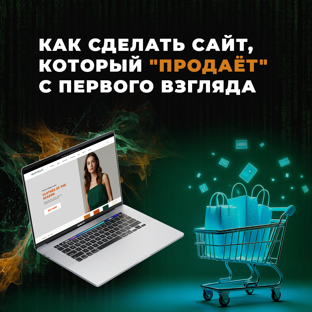
In today's digital world, a website only has a few seconds to make a first impression. And it's those seconds that decide whether a user stays to explore your product or instantly leaves for your competitors.
Website creationwhich literally "sells" at first sight - it is an art that combines the psychology of perception, a competent UX/UI design и strategic approach to content. In this article, let's break down how to make a website that actually brings in customers.
The psychology of colour и typography
Colours and fonts are not just decorative elements. They influence users' emotions, behaviour and decisions.
The right use of these tools can build brand trust, emphasise the status of the product and gently nudge the right action.
- Blue - inspires trust and a sense of reliability. Popular in the banking sector and IT companies.
- Red - evokes a sense of urgency and passion. Great for promotions and CTA-buttons ("Buy Now", "Hurry up and Order").
- Green - associated with health, nature and tranquillity. Ideal for eco-friendly brands and financial themes.
- Black - symbolises luxury and elegance. Often used in the premium segment.
The right colour palette helps to manage the customer's emotions without words, guiding them towards a targeted action.
- Contrasting headlines attract attention and help to quickly orientate.
- Sans serif fonts (e.g. Roboto, Open Sans) improve readability on screens and are suitable for the bulk of websites.
- Fonts with character (like Playfair Display) add personality and work great in headlines.
- The font size should clearly separate the content hierarchy: headings are large, the main text is comfortable for perception (usually 16-18 px).
🧠 Important: It's not enough to choose a "beautiful" font or a "trendy" colour. You need to understand what associations they evoke in your target audience and how this affects sales.
UX/UI - tricks that increase conversion
User Experience (UX) and User Interface (UI) are the foundation of a successful website. The right UX/UI is when a user on the site does not think about navigation, quickly finds the necessary information and easily makes a purchase decision.
Here are the key tricks that really increase conversions:
"First Screen" - as a powerful presentation
The first thing a user sees is your chance to "hook". The first screen of the site should answer three questions in 5 seconds:
- Who are you?
- What are you suggesting?
- Why it's valuable.
Recommendation: a short headline, a sub-headline with a customer benefit and one prominent action button (CTA).
Minimal obstacles on the way to the goal
Every extra registration, extra field on a form, or unclear navigation increases the chance that a user will leave. Simplify the process:
- Shorter forms.
- A simple and straightforward path from interest to purchase.
- Clear CTAs ("Buy", "Find out the price", "Book a consultation").
Micro-animations for engagement
Small animations on mouse-over or scrolling make the site lively and "responsive" to the user's actions. This increases engagement and visually confirms that the site is modern and technologically advanced.
Psychological triggers
- Social proof: testimonials, case studies, numbers ("we are trusted by 5,000 customers").
- Deficit: inscriptions "5 places left", "Promo period - 3 days".
- The principle of ease: make an application in 2 clicks.
Adaptability and speed
More 70% users are accessing websites from mobile devices. Your website must be:
- Adaptive for all screens.
- Load in 2-3 seconds max.
A case study of a successful selling website
To see all this in action, let's take a case study of creating a selling website for a conditional company "Premium Décor" (luxury interior design brand).
Task:
Create a website that:
- Shows the level of the company.
- Motivates you to leave the project application.
What we did:
- Colour psychology: chose deep shades of blue and gold to emphasise the premium nature of the brand.
- Typography: large headlines in the Playfair Display font style convey a sense of elitism, main text in readable Open Sans.
- UX/UI: the first screen has a short slogan "Luxury interiors reflecting your status" and one big button "Leave a project request".
- Animations: smooth appearance of blocks when scrolling, barely noticeable shadows on buttons.
- Triggers: posted testimonials from satisfied customers and photos of finished projects.
- Adaptability: the site works perfectly on smartphones, tablets and laptops.
Result: After the launch, the website conversion increased by 48% compared to the previous version!
Creating a website that "sells" at first sight is not magic or an accident. It is the result of comprehensive work on design, content, colours, fonts and user experience.
The right site:
- Causes emotion.
- Instantly explains the value.
- Helps the customer make a choice.
That's the kind of site we create at Kakadu Studio - sites that work for you!
Discover more from Web студия Kakadoo
Subscribe to get the latest posts sent to your email.