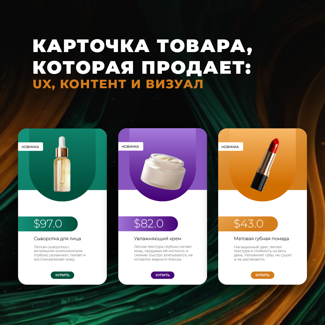
A product card is more than just a description and a photo. It's a miniature sales team that either convinces a customer to place an order or gets them to leave for a competitor. According to Nielsen research, 55% users spend less than 15 seconds on a product page. That means you only have a moment to grab attention and turn a visitor into a buyer. Let's break down what should be in the perfect product card, how to write a conversion-boosting description, and how to create visual content that inspires trust.
What must be in the product card
The ideal product card is a combination of usability, information and visual impact. Here are the key elements you can't do without:
- Clear title - concise but informative. For example, instead of "Men's Sneakers" it is better to write "Nike Air Zoom Pegasus 39 Running Sneakers". Research by the Baymard Institute shows that detailed headlines increase the likelihood of a click on 36%.
- Price and discounts - visible, clear, indicating the old and new price, if there is a discount. Psychologists say that strikethrough prices attract attention and increase the desire to buy.
- Buy button - prominent, contrasting, with a call to action. For example, "Add to basket" or "Buy now". A/B tests show that a bright orange or green button increases conversions by 14-20%.
- Brief characteristics - the main parameters (size, weight, material, capacity, composition, etc.) should be placed in a separate block.
- Reviews and ratings - social proof helps reduce doubt and increase trust. Spiegel Research Centre studies show that products with reviews are bought more often on 270%!
- Delivery and returns - clear delivery terms, costs, deadlines and return policy. 67% buyers are looking for shipping information before buying.
- Availability of goods - Nothing is as annoying as the "Buy" button and then the "Out of stock" button. Show the current stock!
How to write descriptions that boost sales
The text in the product card should answer three main questions:
- What's that?
- Why would I want to do that?
- Why you?
Here are a few rules of thumb:
- Focus on benefits, not just features. For example, instead of "Material: 100% cotton", it is better to write "Soft natural cotton that does not irritate the skin and allows the skin to breathe".
- Use emotional triggers. For example, "Feel like a professional chef with this sharp and handy knife!"
- Short paragraphs and lists. No one likes to read "canvases" of text.
- Uniqueness. Don't copy your competitors' descriptions - search engines don't like that.
- Add answers to frequent questions. This reduces the support burden and removes the buyer's doubts.
Example of a selling description:
❌ Normal: "Blender 500W, 2 speeds, plastic housing."
✅ Selling: "This powerful 500W blender can easily handle any food, and the two speeds allow you to make perfect smoothies, soups, and shakes in seconds!"
Photos and videos: how to make trustworthy content
80% of information people perceive with their eyes, which means visuals are a key element of a product card. What is important?
- Quality photos. Clean background, good lighting, multiple angles.
- Photos in use. Show the product "in action". If it is clothing - on a model, if it is machinery - in operation.
- Video Review. A dynamic overview allows you to view the product from all angles and inspires more trust.
- Feature Images. Infographics with key features - e.g. "IP67 moisture protection" with icons.
- 360°-view. According to eBay, adding interactive photos increases sales by 22%.
- Comparison with competitors. If your product is better - show it clearly!
A product card is not just a page, but a sales tool. Make it user-friendly, informative and visually appealing - and your conversions will increase significantly!
Discover more from Web студия Kakadoo
Subscribe to get the latest posts sent to your email.